A Careful Picture for Something You Cannot Photograph Directly
Visualizing superposition is hard because the thing we want to picture is not an ordinary scene hiding behind a curtain. A quantum system in superposition is not simply half here and half there in the same way a faded photo might show two exposures. It is described by a state that assigns amplitudes to alternatives that can later contribute to different measurement outcomes. Those alternatives may interfere if their phase relationships remain coherent. They may also stop behaving as a usable superposition if information leaks into a detector or environment. The unseen part is not a secret classical image waiting for better eyesight. It is a structure of possible outcomes that only becomes visible through patterns, statistics, and carefully chosen measurements. The best visualizations therefore act like maps, not portraits. They help readers remember that several alternatives are being kept in play, that the alternatives have weights and phase, and that measurement changes what can be observed next. Good pictures should also show their own limits. A cloud, forked path, spinning arrow, or overlapping glow can be useful for one idea and misleading for another. The goal is not to find the perfect drawing of superposition. The goal is to use pictures that guide the mind toward the right experimental questions.
A: No. It is inferred through patterns from controlled measurements.
A: No. A cloud picture usually represents position probabilities.
A: They show alternatives that may later recombine.
A: It controls how alternatives reinforce or cancel.
A: A mixture lacks the same coherent phase relationship.
A: No. They represent an abstract two-level state.
A: The detector defines what evidence can appear.
A: No. Different experiments need different visual aids.
A: It states what it helps with and where it stops.
A: A flexible map of coherent alternatives and possible records.
Why Literal Pictures Fail
Literal pictures fail because superposition is not an ordinary object with blurry edges. A particle in a superposition of paths is not necessarily a tiny bead smeared across a table. A spin superposition is not a miniature arrow physically leaning in two visible directions.
The problem is not that quantum mechanics is against imagination. The problem is that everyday images bring assumptions with them. They suggest hidden positions, ordinary mixtures, or partial ignorance when the real issue is amplitude structure.
If a visualization makes superposition look like a classical uncertainty, it has already lost the main point. In a classical mixture, the system has one condition and we do not know which. In a coherent superposition, alternatives can later combine and interfere.
This is why the best pictures are modest. They do not claim to show what the quantum system really looks like between measurements. They show relationships that matter: alternatives, weights, phase, and possible readout.
A useful image can be inaccurate if treated too literally. The reader should ask what the picture explains and what it quietly distorts.
The Forked Path Picture
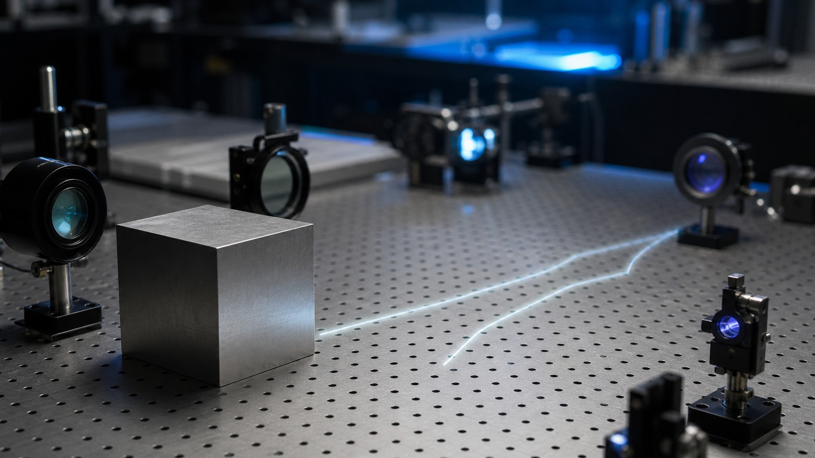
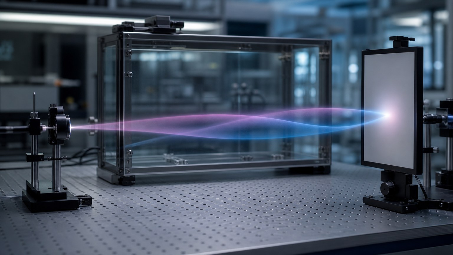
The forked path picture is helpful when explaining interferometers and double-slit experiments. It shows that the experiment allows alternatives that later meet. If no which-path record distinguishes them, their amplitudes can combine.
The danger is that a forked path can make the system look like a tiny traveler choosing routes in secret. That is not what quantum mechanics requires. The state assigns amplitudes to alternatives, and those alternatives are part of one predictive structure.
The picture works best when the paths are treated as experimental alternatives, not private tracks. It should point the reader toward recombination, phase difference, and detection pattern.
When used carefully, the forked path picture gives beginners a bridge into interference without pretending to reveal a hidden classical route.
The Cloud Picture
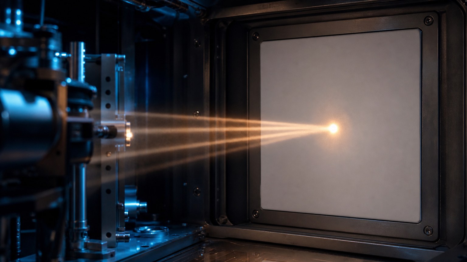
The cloud picture is useful for position probabilities. It can show that a later position measurement is more likely in some regions than in others. Atomic orbitals are often introduced this way.
But the cloud picture can become misleading if readers imagine the particle as a faint gas filling the cloud. The cloud is not a material smear. It represents probability structure, and in quantum mechanics that structure can include phase information not visible in a simple density picture.
A cloud also hides measurement context. Position is only one kind of measurement. A state that looks broad in position may have a different structure in momentum, energy, or spin. One visual cannot carry every possible question.
Still, the cloud picture earns its place when it is tied to repeated measurements. If many identically prepared systems are measured for position, the distribution can resemble the cloud. The picture then becomes statistical rather than literal.
The safest wording is to say that the cloud represents where outcomes tend to appear, not what a particle is made of before measurement.
The Arrow Picture
For two-level systems, such as a simple qubit or spin example, an arrow on a sphere can help. The arrow represents the state, and different orientations correspond to different probabilities for chosen measurements.
This picture is powerful because it shows that superposition is not merely a list of two options. A qubit state can have continuously many orientations, and phase matters. Rotating the arrow changes future readout probabilities.
The danger is that the arrow may look like a physical compass needle. It is not. It is a representation of a state in an abstract space. The real system may be an electron spin, photon polarization, superconducting circuit, or trapped ion.
Used well, the arrow picture makes control easier to imagine. Pulses rotate the state, measurement projects the result, and repeated trials reveal the probabilities associated with that orientation.
The Music Picture
Another helpful metaphor is music. A chord contains several notes at once, and the relationship among notes matters. Change the phase or timing, and the combined sound changes. This can hint at how amplitudes combine.
The metaphor is not exact, but it helps readers feel why superposition is not just many independent pieces. The alternatives have relationships. They can strengthen or weaken later outcomes when brought together.
Music also reminds us that structure can be real without being easily photographed. A harmony is not a pile of visible objects, yet it has measurable consequences. Quantum superposition also has consequences that appear through patterns.
The limit is obvious: quantum states are not sound waves in air. The metaphor should be used to explain relationship and combination, not to replace the physics.
That kind of metaphor is often safer than a cartoon. It suggests structure while leaving room for abstraction.
Why Measurement Changes the Picture
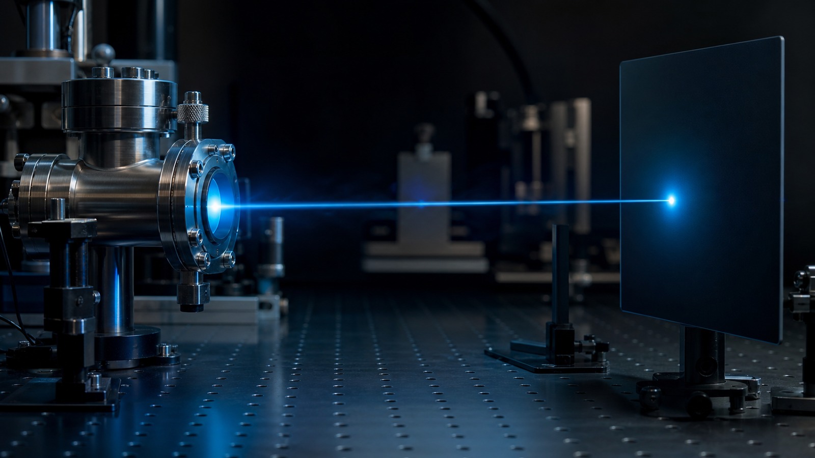
A visualization of superposition must include measurement, because measurement decides what kind of evidence appears. If the setup records which alternative occurred, interference can be lost. If alternatives remain indistinguishable, a pattern can emerge.
This is where many images become too simple. They show several ghostly paths, then jump to one result without explaining the apparatus. The apparatus is not decoration. It defines which question the experiment asks.
Good visual thinking therefore includes preparation, evolution, and readout. It asks what is kept coherent, what is measured, and what information becomes available to the environment.
The picture should not end at the word observed. It should show that observation means physical interaction and record formation.
How to Picture Phase
Phase is difficult to visualize because it is not usually visible in a single probability cloud. One way to picture it is as timing or rhythm attached to alternatives. Alternatives with matching rhythms can reinforce; alternatives with opposing rhythms can cancel.
In drawings, color, wave crests, or rotating arrows can suggest phase. These are aids, not literal truths. Their value is that they remind readers that two alternatives with the same probability weight can still lead to different later results if their phases differ.
Phase is why superposition is richer than a menu of options. It carries relationship, and that relationship becomes visible when alternatives are recombined.
Distinguishing Superposition From Mixture
A good visualization should separate superposition from mixture. A mixture means the system is in one of several possible states, but the description reflects our lack of knowledge or environmental averaging. A superposition means the state itself combines alternatives coherently.
One way to picture the difference is to compare a chord with a shuffled playlist. A chord combines notes at once and produces a sound shaped by their relationships. A shuffled playlist contains several possible songs, but only one is playing at a time.
That metaphor is imperfect, yet it captures a crucial distinction. Coherent alternatives can interfere. Classical uncertainty cannot create the same interference merely by being unknown.
In the laboratory, the distinction is tested by whether alternatives can be recombined to show phase-sensitive effects. If they can, the superposition picture has work to do.
If they cannot, the system may behave more like a mixture for practical purposes.
This difference keeps visualization honest.
What the Best Picture Should Do
The best picture of superposition should make readers more careful, not more certain too quickly. It should help them ask which alternatives exist, whether phase is preserved, and how measurement turns the setup into evidence.
It should also carry a warning label in the mind. No single drawing captures all of superposition. A path picture helps with interferometers. A cloud helps with position statistics. An arrow helps with qubits. A music metaphor helps with relationships.
Switching among pictures is not a weakness. It is a sign that the concept is deeper than any one everyday image. Each picture earns its keep only when matched to the question being asked.
Readers who accept that flexibility are less likely to be fooled by oversimplified cartoons. They can use images without becoming trapped inside them.
That is the practical skill: picture the unseen as a predictive structure, then let experiments decide which part of the picture matters.
Another useful habit is to compare what a picture predicts with what a detector would record. If the picture cannot say how repeated outcomes, interference, or lost coherence would appear, it is probably only decorative. A good visualization should help the reader anticipate evidence.
For example, a forked-path image should invite the question of whether the paths recombine. A cloud image should invite the question of which measurement built the distribution. An arrow image should invite the question of which axis is being read. Those questions keep the visualization connected to physics.
The unseen does not become less real because it resists a single drawing. Many scientific ideas are understood through disciplined representations rather than direct portraits. Superposition simply demands more honesty about where the representation ends.
What a Helpful Picture Must Avoid
A helpful picture should avoid giving every alternative its own tiny classical route. That shortcut makes superposition look like ordinary uncertainty, as if the particle secretly chose one road while the observer lacked the map. Quantum experiments ask for a stronger idea: the alternatives can remain part of one coherent state.
It should also avoid turning probability into a visible substance. A shaded cloud can be useful, but the cloud is not a misty material spread through the room. It is a reminder that different outcomes have different weights under a particular measurement.
Another risk is hiding phase. Many simple drawings show where an outcome may appear but say little about whether alternatives can later reinforce or cancel. A picture of superposition is incomplete if it cannot leave room for interference.
The picture should stay connected to preparation and measurement. A drawing that floats away from the lab can become decorative rather than explanatory. The reader needs to know what was prepared, what was protected, and what was finally recorded.
For that reason, the best visualizations are humble but disciplined. They do not claim to photograph the quantum state. They help readers hold the right relationships in mind.
The Visual Takeaway
Superposition is best pictured as coherent alternatives with amplitudes and phase, not as a literal blurry object.
Use images as maps of experimental possibilities. Keep them flexible, and let measurement context decide what the image can safely mean.